Journalism 152 Section 2

Friday, September 29, 2006


This is my magazine cover re-do. I decided to change the fonts and the spacing between the words. I made a few minor adjustments to the cover, but mainly changed the teaser fonts.

Friday, September 22, 2006


I decided to do this particular cover because it was one of the few stories that I have covered as a photojournalist that interested me enough to further investigate the topic. Maybe it was because I was actually in the O.R., dressed in scrubs from head to toe; but who really knows.

My idea for this magazine came mainly from the photograph I had taken. I liked its look and thought it communicated simplicity, which I like. It's an art/art history magazine with lots of photographs and art work. Because the photograph is black and white, I added some color in the title to give it some life while maintaining the simple and clean design I was going for.


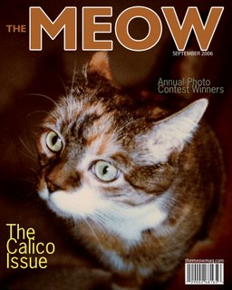
This is a photo I took of my cat, Amber. At first I wanted to design a "Cat Fancy" cover, but then I decided to invent my own magazine. I color matched the font colors to be the color of the cat's fur and eyes to unify the whole cover. I tried to keep it simple and not too cluttered.


Ryan Howard is having an incredible season so I thought that I would create a magazine cover dedicated to him. I decided to only make him black and white with a colored background. I did this because he is quickly becoming a sports icon, so I thought that he deserved a classic feel.


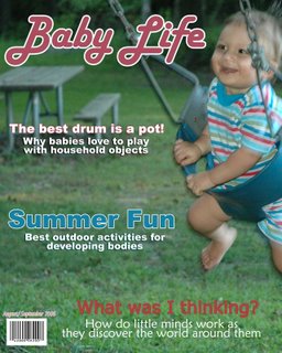
This is my baby Anthony this past summer. I love baby magazines and I thought this photo was very cute. So I combined the two. My husband, Jamie, took the photo.