Saturday, October 28, 2006
Friday, October 27, 2006
Thursday, October 26, 2006

This is a BBC daily newspaper design I came up with. I enjoy listening to their podcasts and reading the news on the BBC website, so I figured I'd make a design based on some of the stories I've come across. It's a mix of British and world news with a lot of features. Complete with British spelling.
I used orange for the nameplate since that's not really a color that's used much for newspapers. I did my best to replicate the BBC logo as accurately as possible.
Wednesday, October 11, 2006

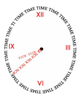
I had a hard time with this project. First, I couldn't figure out how to type around a shape. Once I did figure it out in the TECH center, it turned out that my home Photoshop version refused to perform that function. :( Then I spent hours trying to figure out how to strech and flip letters... And then I just ran out of ideas and got very upset. So this piece was born. Originally it said "So Upset" and contain all my mean thoughts at the moment. But then I decided to switch it to "So Happy" to add a positive note. So here it is.
Tuesday, October 10, 2006
 For my type assignment, I decided to make a news magazine cover for a story about modern urban life. The red text is of words of various minorities, subcultures, and other labels in a gritty font. It's supposed to look like a brick wall obscuring the word "assimilation," implying that modern multi-culturalism is stronger than homogenization. I enjoy social criticism.
 I was inspired by the Esquire cover that just had the quote "Oh my god - we just hit a little girl." Thus all the negative space for impact. It's simple, but those are the kinds of designs that I like to work with.


